We were given an open-ended class assignment where we had the freedom to choose our own content and curate them into a designed booklet of some sort.
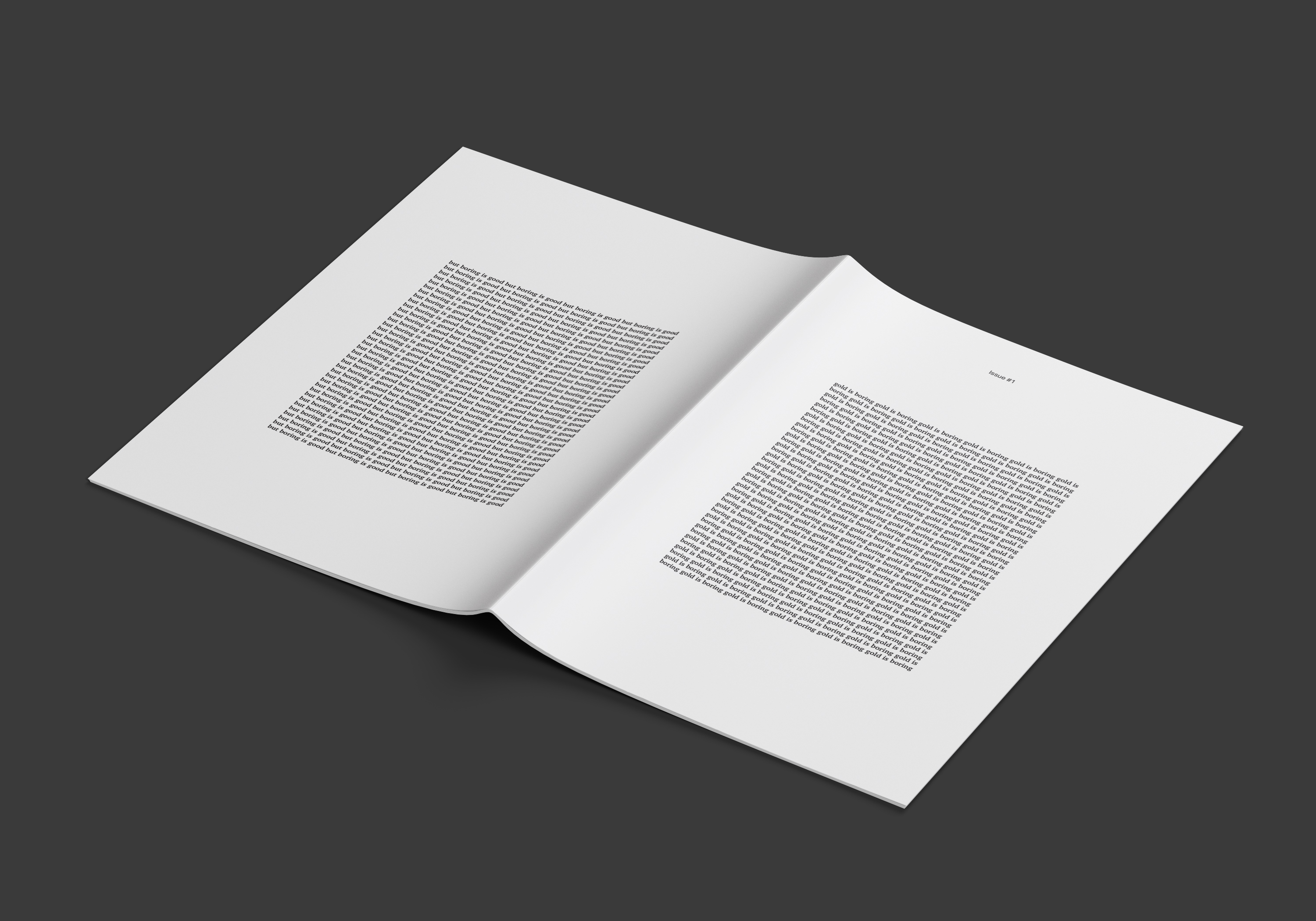
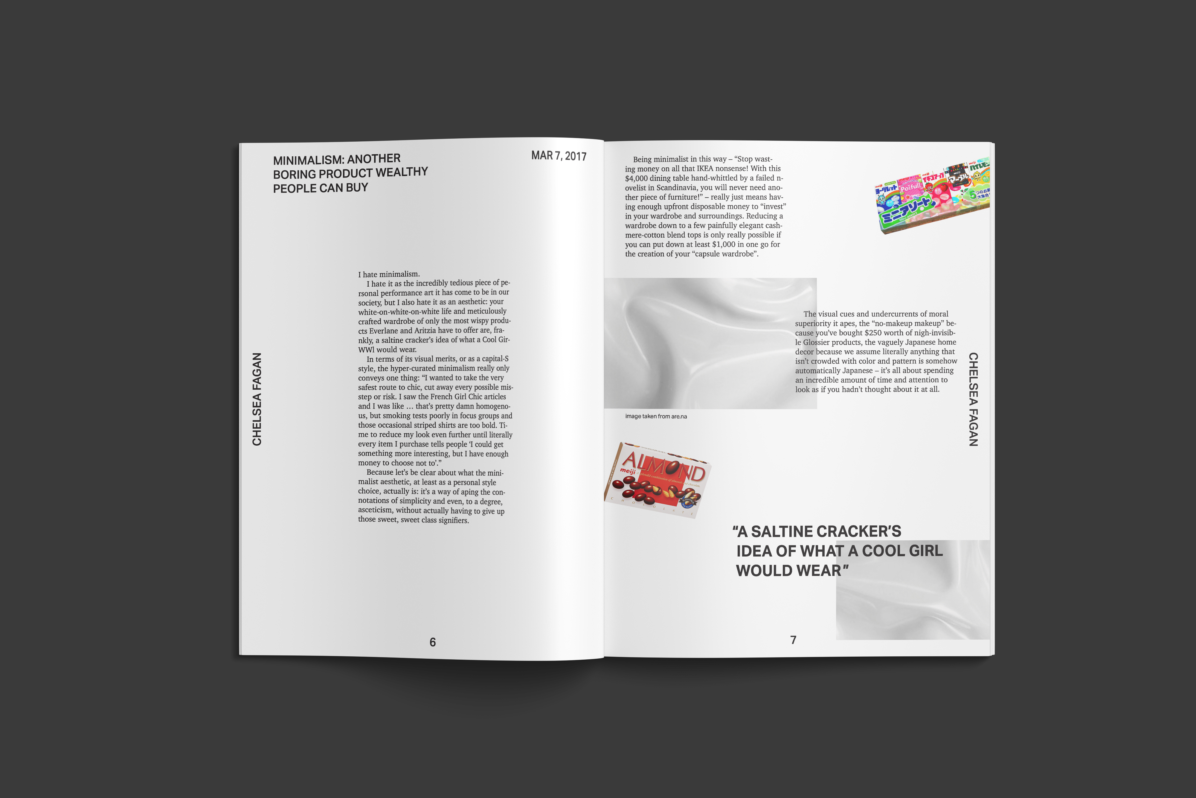
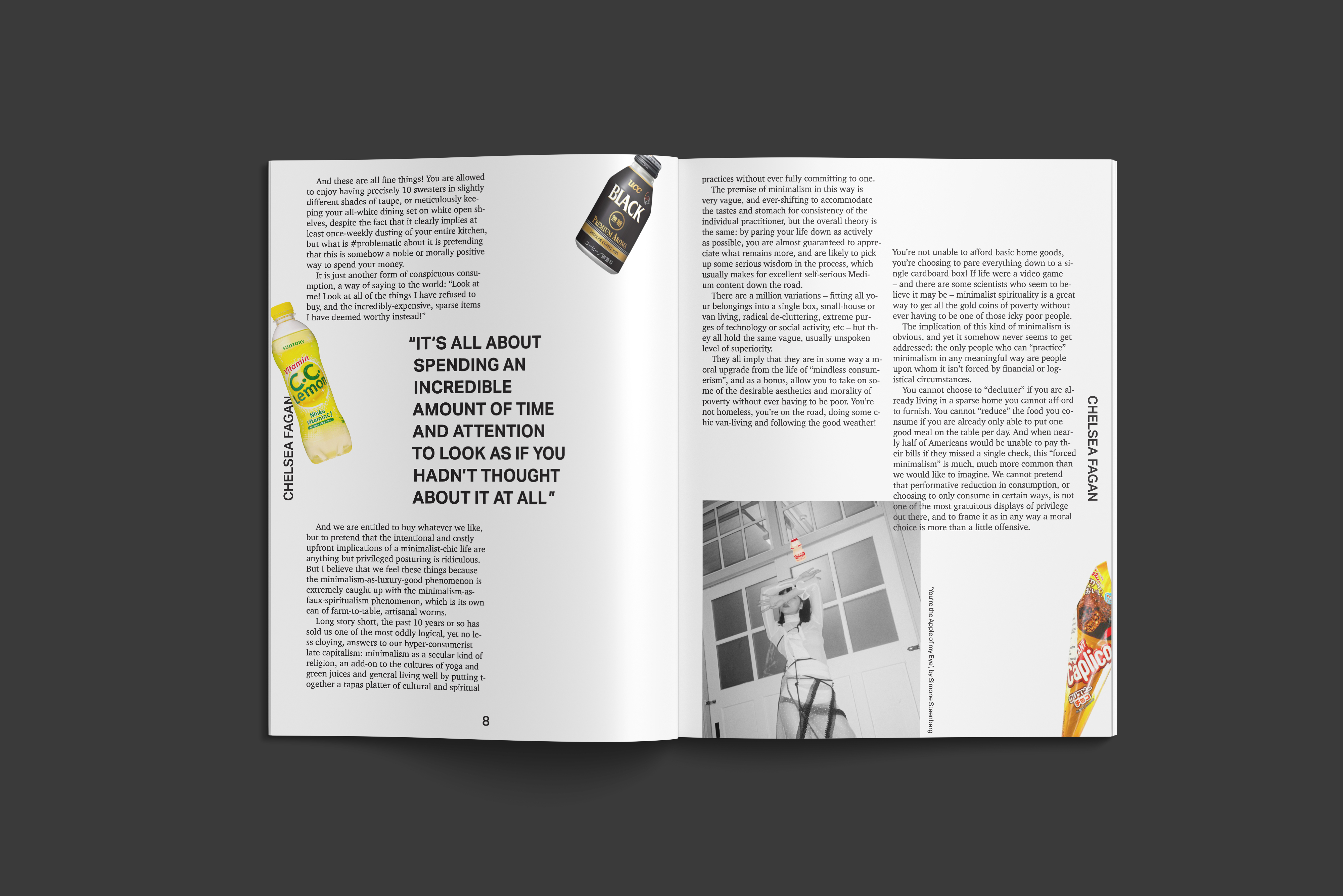
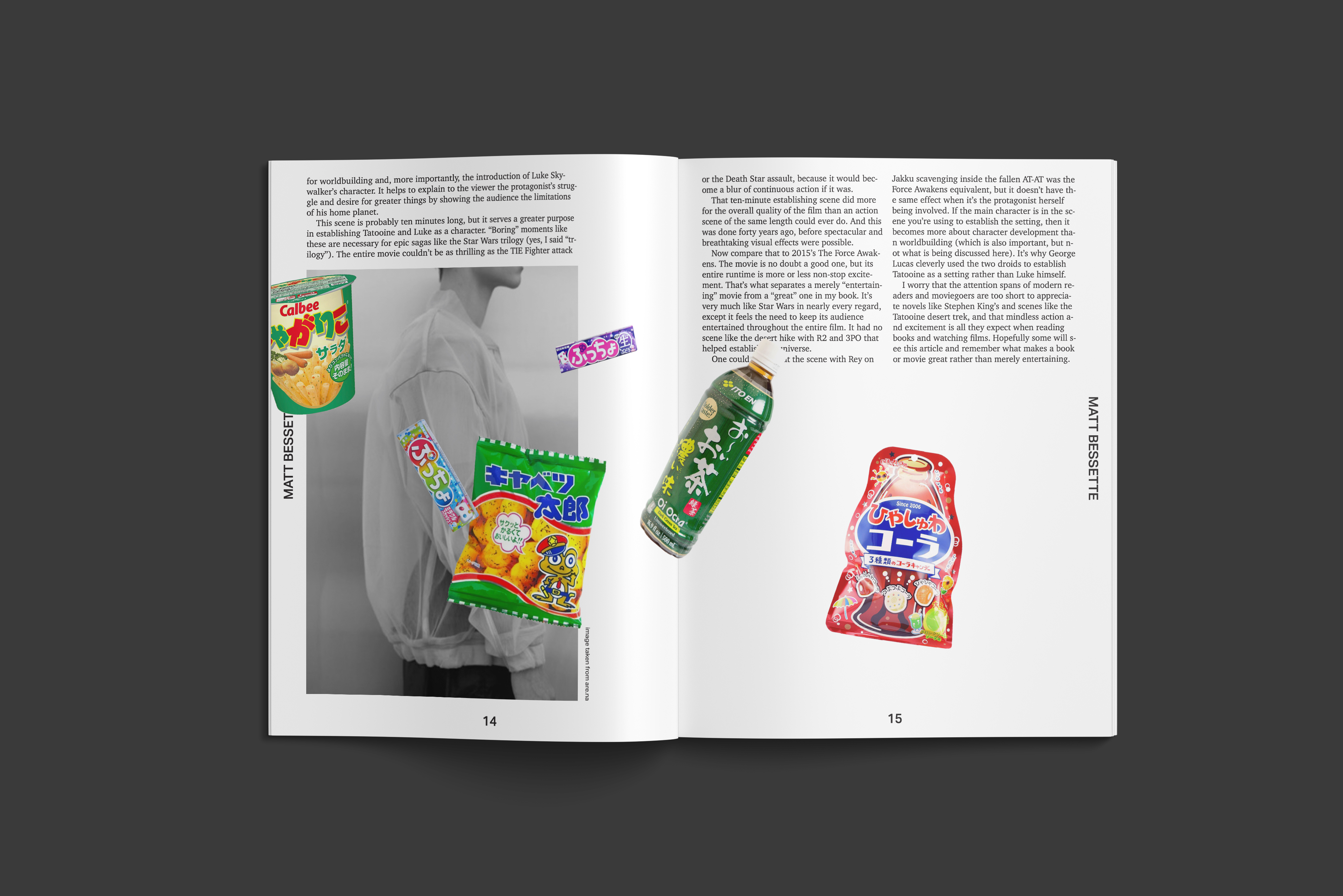
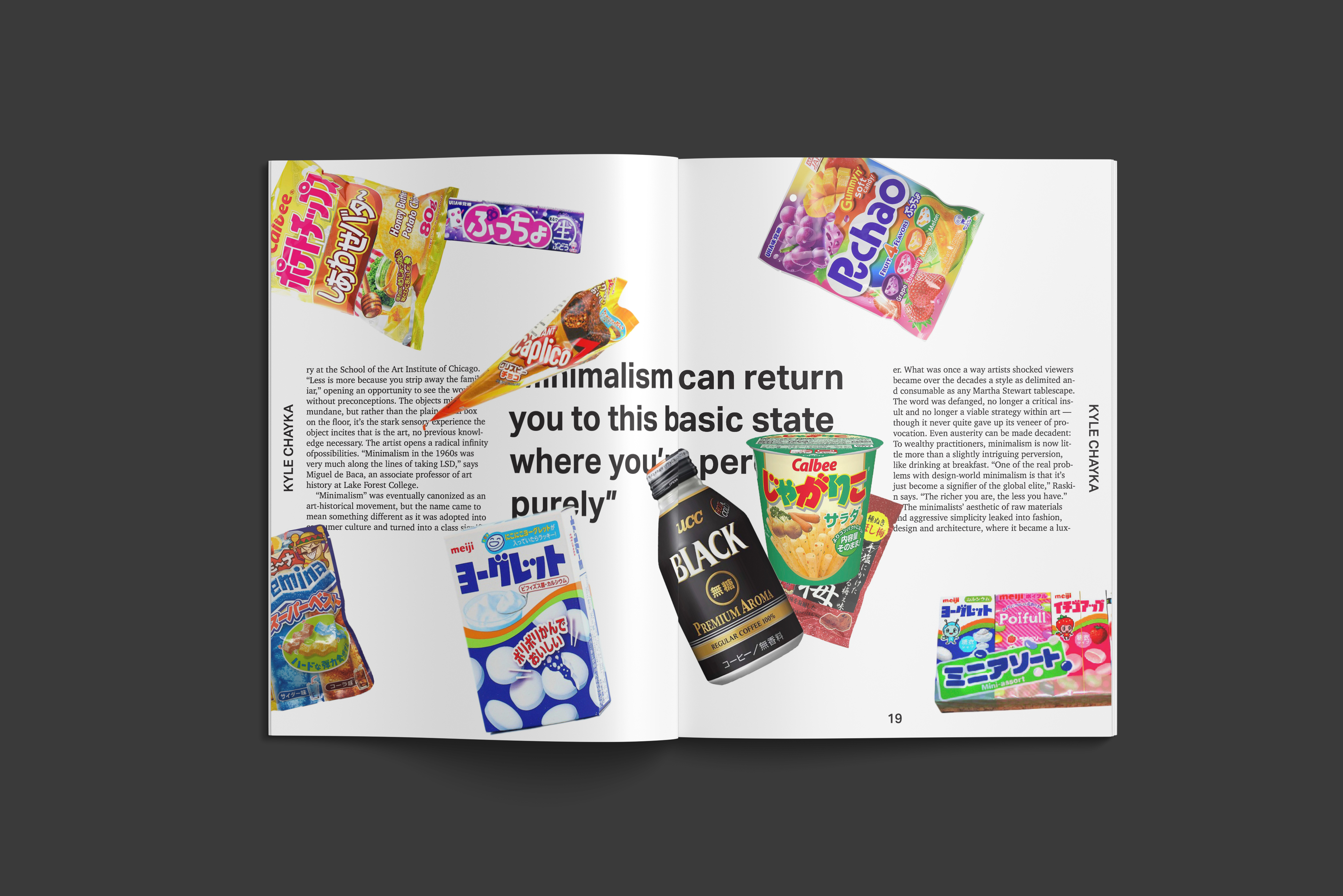
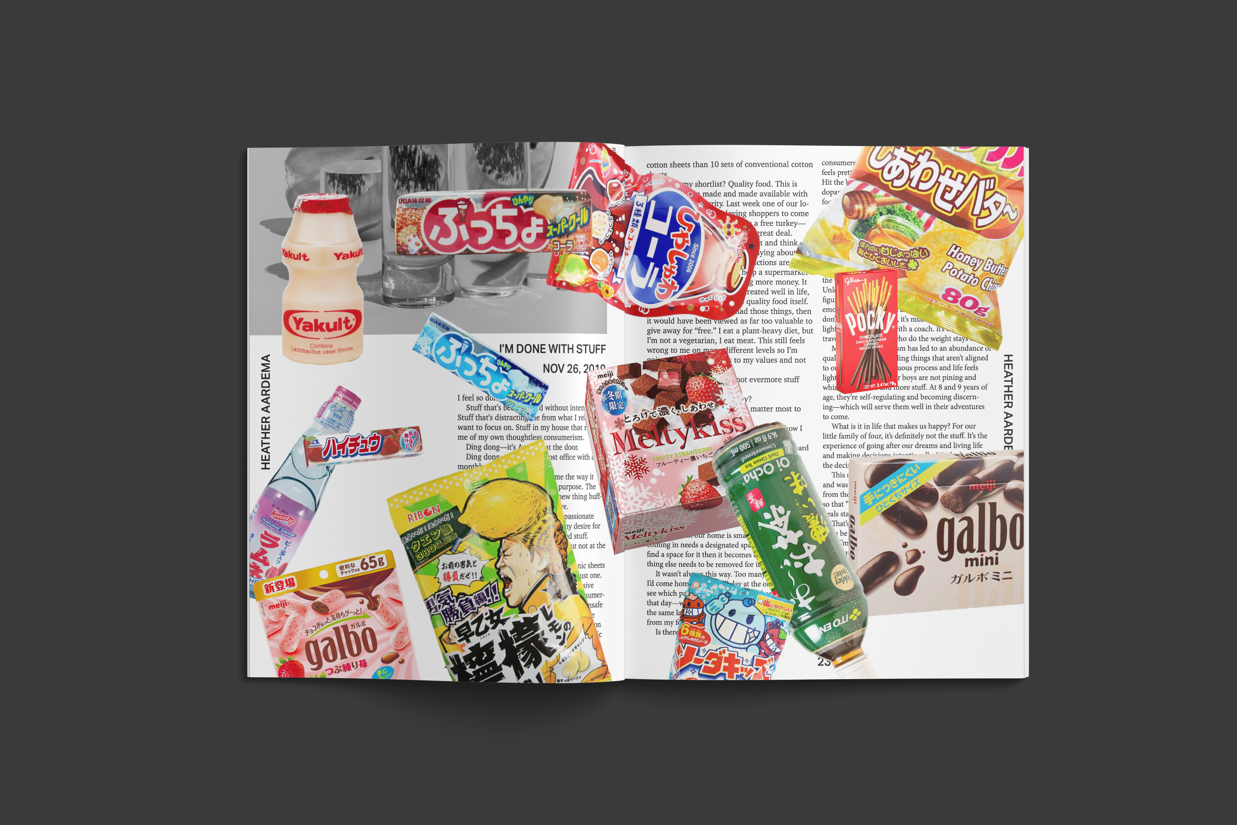
‘Gold is Boring’ is an anthology of articles written by various authors about their differing views on minimalism. The simple layout of the articles are contrasted with images of Japanese snacks, a symbol of maximalism due to its mesmerizing packaging, chaotically placed over the spreads as the zine progresses. This reflects the conflicting opinions on minimalism as discussed in the articles throughout.
I was inspired by gold, as the title suggests, due to how people often use it as a signifier of wealth and extravagance despite its simple chemical makeup. To me, gold is a representation of the dichotomy between minimalism and maximalism.
Applications Used: Adobe Indesign, Adobe Photoshop
